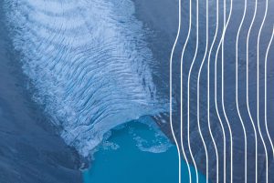
GUARDIANS OF THE ICE LOGO
Our logo is intended to convey much about our central concerns in simple forms and tones.
GUARDIANS OF THE ICE LOGO
Our logo is intended to convey much about our central concerns in simple forms and tones.


OUR DESIGNER LIN OOSTERHOFF EXPLAINS:
The lines represent crevasses within the glacier as well as the vertical motion of melting and evaporation.
Each line stands for one of the twelve guardian/ sentinel mountains that surround and protect the Icefield.
The spare, minimalist approach is designed to convey the strength, elegance and serenity of nature.
The blue colour palette seeks to complement the natural translucence of virgin ice. Yellow/orange symbolizes earth.
OUR MISSION
To marry art and science in film, photography and text to illuminate the significance of what is being lost and the infinite possibilities to be realized in grappling with this urgent global climate crisis.
To mobilize a broad social movement around the retreat of the Columbia Icefield breaking the logjam of apathy and complacency towards the climate crisis. We can accomplish this by becoming committed climate activists in a community of individual action, community collaboration and policy change.